journal
« Portfolio Expansion I • Time Saved »
Creating: Three Stationery Packages
Posted on 14th May, 2005 at 8:10pm by joel

“Creating: Three Stationery Packages” is the second entry in my “Creating:” series of journal entries. This entry discusses the three stationery packages added to my portfolio today.
Rather than post this as three individual “Creating:” journal entries, I have decided to combine these three pieces into one entry. All of these stationery packages share a lot of features and characteristics and by discussing them all at once, you the reader can compare and contrast the different solutions and design features employed.
the pieces
In designing stationery packages for THE Design, Valley Dental Technologies, and Curtis Marketing Group, I was afforded a lot of freedom and opportunity to experiment and use interesting techniques in the designs. All three packages needed to be modern and stylish in appearance while retaining a distinct uniqueness to help build a solid company brand.
THE Design Stationery
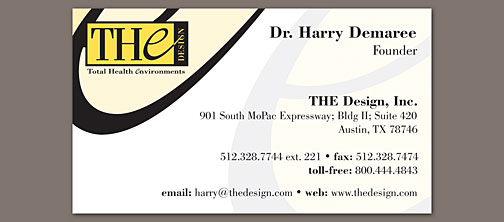
When I first saw THE Design’s logo, I knew instantly what the most important and distinctive feature would be. While all the text is set in the beautiful Bodoni typeface, the E in THE is a graceful, script, lowercase e. The shape and curves of that e just begged to be used and used often.
The very first project we had to design for THE was their web site. I immediately took that e, pulled it out of the logo to stand on its own, and used it as a major design feature of the site. As you can see, the e dominates the design and allowed me to make liberal use of rounded corners and curves throughout the site. This gives a very organic feel to a design that would otherwise have ended up very squared-off and sharp like the logo itself.
 THE Design business card
Fortunately, THE enjoyed that use of the e as much as I did and I went ahead and started on the new stationery pieces. Frankly, there is no escaping the e. It is absolutely everywhere. The stationery afforded me even more flexibility in applying it to the design, as I did not have to worry about taking up too much screen space with the bottom of the curve. So, rather than cut off the base of the e as on the web site, I let it flow in its entirety. I toyed with the idea of using drop shadows beneath the e, but scrapped that in favor of a completely illustrated, flat, seamless look. The e begged to flow uninhibited through the pieces.
Of course, using the e in the upper left-hand corner wouldn’t nearly be enough, so a large watermark bleeding off the bottom-right corner was added as well. If someone were to ask why such an accent on the e, I could easily weave an explanation in which it stands for “excellence” or the THE Design “experience,” but it also looks really cool juxtaposed with the squareness of the logo and the paper.
By insisting on having the e bleed off the upper-left corner of all the pieces, I forced us to have to convert the envelopes. (If you aren’t familiar with converting envelopes, it means that the artwork is printed on a flat sheet of paper that is cut out and folded into the envelope after printing.) As a result, the back flap was fair game for as much artwork as I desired. I let the e flow onto the flap and around the left edge. We toyed with the idea of doing the same with the watermark, but decided against it. The fold-over note card received similar treatment.
Frankly, I don’t think there is anything I would change about this stationery design. Unlike the text on the Curtis Group Stationery as I describe below, using the logo typeface throughout these designs worked well. The contact details on the left edge of the letterhead take up considerable horizontal space, but the completely open top and bottom areas makes up for it.
Have a look at the THE Design Stationery on its portfolio page ›
Valley Dental Technologies Stationery
Valley Dental Arts is known for the world-class dental restorations produced one-by-one by some of the most skilled lab technicians on the planet. Their customers are almost entirely individual dentists who need restorations for their patients. However, because of VDA’s size and technological abilities, they can also quickly produce good quality restorations at more affordable prices.
VDA created a separate division called Valley Dental Technologies and is using it to work with smaller dental labs who otherwise could not afford to produce restorations as quickly and cheaply as VDA is capable. This division needed a unique identity that would focus on VDT’s technical focus while still retaining the reputation VDA possesses in the dental community.
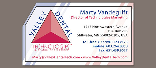
 Valley Dental Technologies business card
Compare the VDT logo with that of Valley Dental Arts. While they are extremely similar, the VDT version is cleaner, simpler, and more technical in its focus. The stationery pieces would have to continue this trend.
We decided to echo the angle of the triangle by cutting off the upper-left corner of all the single-sheet stationery pieces (Obviously, that wouldn’t work so well on the envelopes.). I also wanted to continue to echo those angles with some strong striping to bring the color of the logo throughout the stationery and push the modern look. I had initially tried screening back the stripes enough to allow them to serve as a watermark on the pieces. Unfortunately, because unlike the THE Design stationery above there was no strong artwork other than the logo, the pieces ended up looking completely washed out.
Porcelain to the rescue! Huh? VDT’s primary product makes use of a porcelain substance called LAVA. Because real teeth are translucent, this porcelain is as well. The restorations are built up layer by layer of porcelain on top of a colored core. This method produces fake teeth that reflect and scatter light in the same eerie way as real teeth (Go look closely at your teeth in a mirror. You’ll be surprised to see that the surface isn’t completely opaque���though nearly so.)
Anyway, I mimicked the porcelain layers of the restorations with the translucent “sheet” of white with a thin black border. This allowed me to let richer blues and reds show through on the edges of the pieces and still have a white enough surface in the middle for overlying text to be readable. I also decided to open up the letterhead and notepad as much as possible by running the contact details vertically down the right edge outside this “porcelain” box.
The end result is a stationery package that is very technical in appearance and unlike anything I’ve designed before. The angled corner, vertical text, and porcelain box all make an interesting brand for VDT���one they are very happy with, and that’s the most important part.
Have a look at the Valley Dental Technologies Stationery on its portfolio page ›
Curtis Marketing Group Stationery
When Curtis Marketing Group moved into their new offices in St. Joseph, it was time for some updated stationery. This was the second move in fewer than two years and because the first move was designed to be temporary, new stationery pieces were not designed or printed.
 Curtis Marketing Group business card
To save on printing fees this time around, I was required to design these pieces without any bleeds. I also was charged with coming up with a design that would work well with the existing logo yet feel modern and current and cleaner than the old designs that had been created at the same time as the logo.
The large faded out globes in the background are a design feature that we wanted to carry over from the old designs. Without bleeds, however, this globe would pose a problem. I decided that rather than center it on the pieces or fade it out at the edges, I would embrace the edge of the paper and use a line and shadow to not only give me a termination point for the globe, but to add a subtle feeling of depth and white-on-white like the web site.
This combination of a line and shadow ended up looking a little bit like a cut had been made in the sheet of paper—an effect that I particularly enjoyed. It felt, if not edgy, at least interesting and modern. I faded these “cuts” out at the ends to avoid getting the “letterhead in a box” feeling that can easily happen when the edges have a border.
I also left these pieces as white and open as possible. Obviously, a letterhead has to be overwhelmingly light colored to work well as a letter writing medium. However, I kept the artwork at an absolute minimum to embrace that stylish clean feeling. Business cards and envelopes offer more opportunities for color, but I resisted taking them.
Finally, there are a few things that I would definitely do differently were I to have a chance to rework these designs. First of all, I wouldn’t use the same typeface as the logo for all of the contact details. While it looks great in the logo, when used in a large block of text, it gets very hard to read and is uncomfortable and old-fashioned looking. I was not completely satisfied with it at the time, but foolishly figured that the consistent font would be for the best. I’d also make the business card logo much, much smaller. It is huge, though it is much less overwhelming in person. Other than those two changes, I think the designs are successful and work well.
Have a look at the Curtis Marketing Group Stationery on its portfolio page ›
final thoughts
I don’t have much to say to wrap this up. If you have not checked out the individual portfolio pages for these three pieces, go ahead and visit the portfolio page for “stationery & identity”.
Filed under: Creating:, graphic design, portfolio
You can follow any responses to this entry through the RSS 2.0 feed. Both comments and pings are currently closed.
One Response to “Creating: Three Stationery Packages”
archives
last 12 posts
- R.I.P. Steve
- Save the Date
- SOLD!
- Countdown
- It’s time to blow this thing up
- For Sale
- Helvetica
- The Web Design Survey 2007
- HB2Me
- A Hero Departs
- A Week With Family
- I am a statistic
all categories
- view all ›
- Apple (3)
- art (3)
- cars (1)
- Creating: (2)
- creative writing (1)
- graphic design (8)
- meta (15)
- portfolio (5)
- ramblings (22)
- rants (2)
- sports (5)
- St. John's (1)
- uncategorized (1)
- webdev (8)
1joelschou.com v3.0 › ?p=53 » Portfolio Expansion I sayeth:
14th May, 2005 at 7:58pm
[…] resting information about the design of these three packages, read my journal entry “ […]