portfolio
Curtis Marketing Group Stationery
quick thumbnails
Here are some quick thumbnails with short captions. Larger thumbnails and interesting descriptions are found below.
 business card
 letterhead
 no. 10 envelope
All of these pieces are in proportion to each other, except the business card which is shown at 200% relative size.
more details
For an extended write-up on some of the more interesting and important features of this stationery, please read my journal entry, “Creating: Three Stationery Packages”.
 business card
As you can see, there are no bleeds in these pieces. This saved on printing costs.
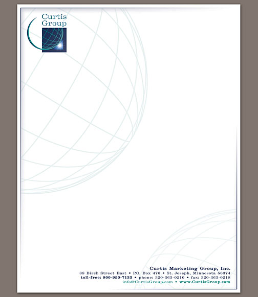
 letterhead
Like the old letterhead, this version has the contact details at the bottom, allowing the reader to get to the important information on the letterhead as quickly as possible.
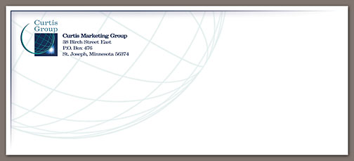
 no. 10 envelope
This close up view of the envelope illustrates the faded globe and interesting depth given by the “cut” and shadow.