portfolio
THE Design Stationery
quick thumbnails
THE Design is a world leader in dental office design. Their floorplans and designs are without equal for their beauty, productivity, and comfort. Their stationery had to reflect the modern, smooth, and unique appeal of the offices they design.
Here are some quick thumbnails with short captions. Larger thumbnails and interesting descriptions are found below.
-
 business card
 -
 mailing label
 -
 letterhead
 -
 notepad
 -
 front of the no. 10 envelope
 -
 rear of the no. 10 envelope
 -
 front of the a6 envelope
 -
 rear of the a6 envelope
 -
 front of the fold-over note card
 -
 rear of the fold-over note card
All of these pieces are in proportion to each other, except the business card which is shown at 200% relative size.
more details
For an extended write-up on some of the more interesting and important features of this stationery, please read my journal entry, “Creating: Three Stationery Packages”.
 business card
The beautiful flowing e is obviously the unique feature of the logo and begged to be pulled out and used as the focal point of the stationery pieces themselves.
 mailing label
Because these labels are designed to be stuck on a larger surface, artwork that bleeds wouldn’t work as well as it does on free-standing pieces.
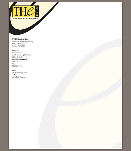 letterhead
The huge e in the background adds a touch of class and color to the letterhead while still allowing writing and typing to be clearly legible.
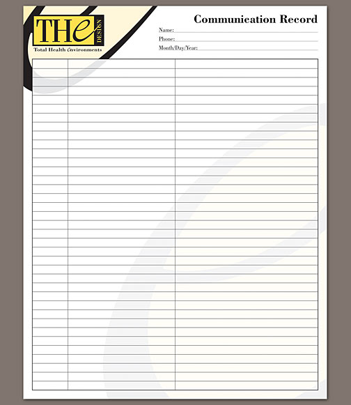 notepad
Like the web site, this notepad required that the e sacrifice its lower curve for the sake of important content.
 front of the no. 10 envelope
 rear of the no. 10 envelope
 front of the a6 envelope
 rear of the a6 envelope
Both of the envelopes allowed me to take advantage of the bleeding artwork to bring heavy use of color and a bit of style onto the rear flap.
 front of the fold-over note card
 rear of the fold-over note card
The fold-over note card also uses a lot of color as the artwork flows over the fold and onto the rear. Thankfully, no one has to write on the outside of this piece.
featured painting
-
- melody: movements one through five
- acrylic on canvas
- october 2004
- not for sale
- learn more about this piece ›