portfolio
Valley Dental Arts AACD direct mail invitation
quick thumbnails
Here are some quick thumbnails with short captions. Larger thumbnails are found below.
 front of the folded invite
 rear of the folded invite
 outside of the invite when unfolded
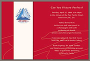 inside of the invite when unfolded
 translucent rice paper insert
 rsvp card
All of these pieces are in proportion to each other. The folded invitation is 4 1/2″ wide by 6″ tall.
more details
These invitations were sent out to every AACD member prior to the 2004 edition of their yearly convention. VDA hosted a large gathering at this convention as a way to promote their products to these dentists. While the “Beauty” magazine ad was the first piece to be done in VDA’s 2004 rebranding, this invitation and the AACD party was the true launching point.
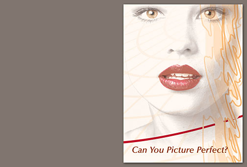 front of the folded invite
This invitation was sent in translucent white a6 envelopes to give a sneak peek at VDA’s new look and entice the recipient to investigate what was inside.
 rear of the folded invite
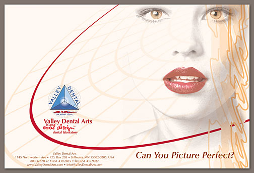 outside of the invite when unfolded
The design wraps around the outside of the invitation so that no matter which side of the envelope the recipient saw first, he or she was immediately introduced to the bold new VDA style.
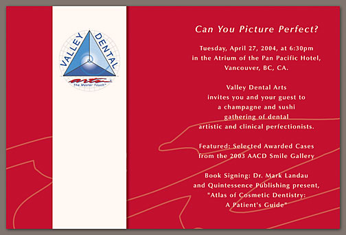 inside of the invite when unfolded
The most unusual—and my favorite—part of the invitation was the shockingly red inside. By giving the soft off-white invitation a bright, bold inner surface, the piece immediately feels like more than just a sheet of paper folded in half. The inside takes a life of its own and it is impossible to ignore.
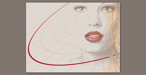 translucent rice paper insert
Upon opening the invitation, the recipient found more translucent paper. I have attempted to reproduce the translucent nature of the rice paper here, but it doesn’t translate well to digital form (compare the brightness of the off-white with the RSVP card below to get a gist of what I’m showing). Regardless, this insert gives the invitation a bit more of a formal feeling not unlike a wedding invitation. Printing on the translucent paper worked surprisingly well.
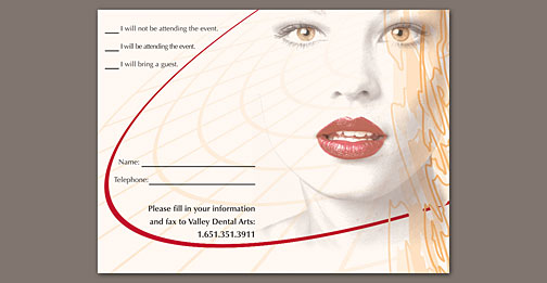 rsvp card
Right behind the translucent sheet was the RSVP card. The background artwork of both inserts was identical, so the printing on the translucent paper produced a unique, though ghostly, effect when the two inserts were not perfectly aligned.