portfolio
THE Design “Dream Kit” direct mail campaign
more details: the “Black Book”
This “show-and-tell” or “look book” serves one purpose and serves it well: to show off what THE Design is capable of designing for their clients. These photographs show off some of the finest design work THE has to offer.
 front cover
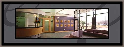 pages 2-3
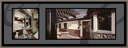 pages 4-5
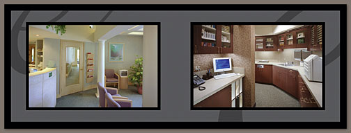 pages 6-7
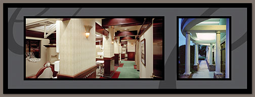 pages 8-9
These images are a little deceiving. The two shades of gray in the background are not that light on the finished pieces. We highlighted the images and the darkest black by running a fifth plate on the press with gloss varnish. As a result, that rich black and the color images have a very shiny finish while the gray shades have a finish somewhere between satin and matte. The result is a stunning contrast that gives the impression of a “black-on-black” print job.
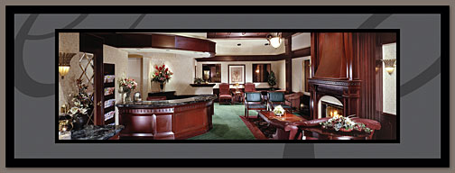 pages 10-11
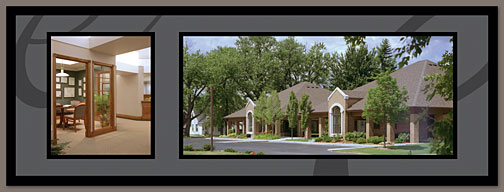 pages 12-13
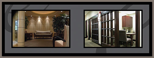 pages 14-15
 pages 16-17
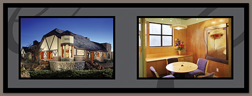 pages 18-19
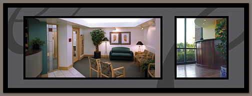 pages 20-21
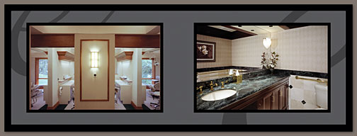 pages 22-23
All of the images are 3 1/4″ tall. The widest panoramic images are a full 10″ wide. As result, this little pocket-sized booklet takes advantage of the horizontal setup to display rather large photos in a very stunning fashion.
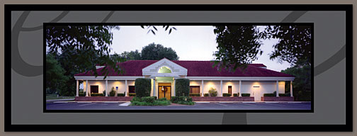 pages 24-25
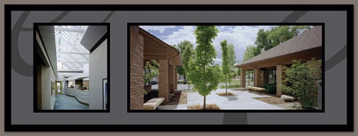 pages 26-27
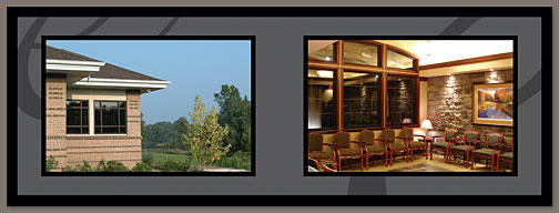 pages 28-29
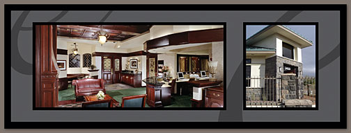 pages 30-31
 rear cover
As tempting as it was to use some of THE’s yellow as an accent color, I knew that it would make for a much classier piece to banish the yellow completely from the design and use a lighter gray instead. After seeing the finished pieces, I am absolutely, 100%, without-a-doubt convinced that I made the correct choice.