portfolio
Curtis Marketing Group
quick thumbnails
Here are some quick thumbnails with short captions. Larger thumbnails with interesting descriptions, tidbits, and links are found below.
 home page
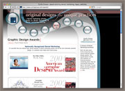 internal page with hover
 three-column internal page
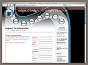 one-column internal page with a filled sidebar
Visit curtisgroup.com ›
more details
For an extended write-up on some of the more interesting and important features of this web site, please read my journal entry, “Creating: curtisgroup.com”.
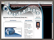
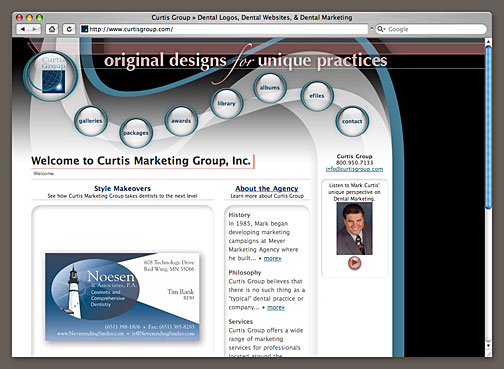 home page
This site was designed to give visitors quick and obvious access to the most important sections of the site and to help them navigate through and eventually request information. The large glassy buttons are nearly impossible to miss and the flow of the header draws the eye from the logo, through the buttons, to the primary contact information, and then to the main content.
My boss (As an employee of Curtis Marketing Group, I have been doing all our corporate design) wanted a design that was “loose and mystical, almost dream-like” in its feeling. The translucent waves, weaving curves, fuzzy gradients, and white-on-white treatment of the content region all combine to create a site that is unique, unusual, and quite unlike the stereotypical “CSS layout” to which many people have grown accustomed.
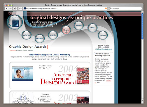 internal page with hover
There is not a single line of javascript in this site’s main design template. The color changes on the button rollovers are all accomplished using CSS and Dave Shea’s sprites. Also, the popup text captions that appear on rollover are also completely text- and CSS-based. These rollovers use Eric Meyer’s pure css popups.
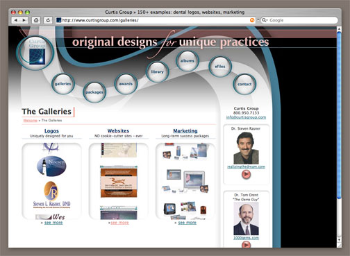 three-column internal page
The columns are designed to be modular and interchangeable. This three-column page could be converted into any one of several other layouts by changing the class name applied to that column’s DIV. The changes require the designer to make no trips to the CSS file or adjust any other HTML. Here’s a quick example.
The Packages page is a three column layout, just like the Galleries page shown in the thumbnail above. Stripped down, the code looks like this:
<div class="content3a">
	<h2><a href="logo">Logo Design Levels</a></h2>
	<h2><a href="website">Build Your Website</a></h2>
</div>
<div class="content3b">
	<h2><a href="http://www.curtisgroupsystem.com">
		Curtis Group System</a></h2>
</div>
<div class="content3c">
	<h2><a href="http://www.curtisgroupstyle.com">
		Curtis Group Style</a></h2>
</div>
I can change this so “Logo Design Levels” and “Build Your Website” get a full-width box and “Curtis Group System” and “Curtis Group Style” are below that full-width box and are split 50-50 by making four changes to the code so it now looks like this:
<div class="content1a">
	<h2><a href="logo">Logo Design Levels</a></h2>
	<h2><a href="website">Build Your Website</a></h2>
</div>
<div class="content2a">
	<h2><a href="http://www.curtisgroupsystem.com">
		Curtis Group System</a></h2>
</div>
<div class="content2b">
	<h2><a href="http://www.curtisgroupstyle.com">
		Curtis Group Style</a></h2>
</div>
Can you spot the difference? Check the class name on the DIVs. That’s all that changed. The CSS takes care of the rest.
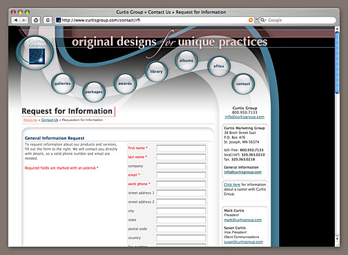 one-column internal page with a filled sidebar
Unlike previous incarnations of curtisgroup.com, this version of the site has a full, functional sidebar that is consistent with the rest of the site design and works well without either sticking out or blending in so much as to be unnoticed.
Flash audio buttons are embedded using the valid Flash Satay technique. Unfortunately, I have yet to find a way to set the background color of these audio buttons using a valid technique, so my bgcolor="#ff7e70" continues to return invalid pages. Drat.