portfolio
Valley Dental Technologies Stationery
quick thumbnails
Here are some quick thumbnails with short captions. Larger thumbnails and interesting descriptions are found below.
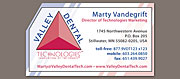 business card
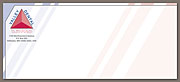 front of the no. 10 envelope
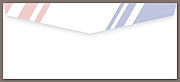 rear of the no. 10 envelope
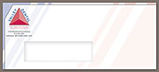 front of the no. 10 window envelope
 letteread
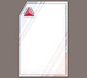 notepad
All of these pieces are in proportion to each other, except the business card which is shown at 200% relative size.
more details
For an extended write-up on some of the more interesting and important features of this stationery, please read my journal entry, “Creating: Three Stationery Packages”.
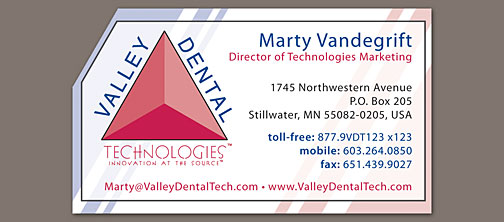 business card
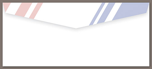
The angled corner and hard diagonal stripes echo the triangle of the logo and give these pieces a very technical appearance, just what VDT was looking for.
 front of the no. 10 envelope
 rear of the no. 10 envelope
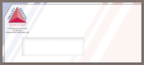 front of the no. 10 window envelope
The window envelope is obviously identical to the non-window variety. Taking the stripes over the fold at the top and allowing them to bleed off the flap makes for a very unique, interesting, and colorful envelope that is sure to catch the eye of the recipient.
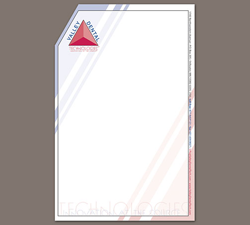
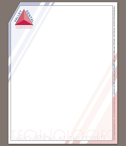 letterhead
The “porcelain” box is white enough to make the letterhead and notepad useful. It also allows the brighter blues and reds of the stripes to peek out along the edge and give a needed shot of color.
 notepad
By moving the contact details vertically to the right edge, I was able to open up the white area and provide more space for writing and typing while still doing something interesting with the design.